How to Brief a Logo Designer (and What Makes a Logo Memorable)
A memorable logo starts with a clear brief. Here's what makes a mark stick, a one-page brief template you can fill in, and how to give feedback that improves the design.
Most disappointing logos aren’t the designer’s fault alone. They come from a brief that said “modern, clean and professional”, which describes nearly every logo ever made. If you want to know how to brief a logo designer, start by understanding what makes a logo memorable, then write a short brief that gives the designer the facts they need and the freedom to find an idea.
This guide covers both, with a template you can copy. It’s the same thinking that sits behind our logo design service, where every project starts with a one-page brief the client approves.
Quick answer: Brief a logo designer with facts, not a picture: who your customers are, which competitors they compare you with, three words you want people to associate with you, every place the logo must work, and any constraints such as languages or colours to keep. Add logos you like and dislike with a reason for each, agree who approves, and judge concepts against the brief, not personal taste.
What makes a logo memorable
People don’t study logos. They glance at them on a shop sign, a browser tab or a delivery box. A memorable logo survives that glance. In practice, that comes down to five qualities.
1. Simplicity
A simple shape is easier to recall and redraw from memory. If you can’t describe your logo in a sentence, such as “a blue circle with a cut-out arrow”, it’s probably too busy.
2. Distinctiveness within the category
Memorability is relative. A leaf is forgettable on an organic food brand because every organic brand has one. The same leaf might stand out for an accounting firm. This is why a designer needs to know your competitors.
3. A link to something true
The best marks connect to an idea about the business: its name, what it does, how it works or the feeling it wants to create. The link doesn’t need to be literal, but it should be explainable.
4. It works at every size
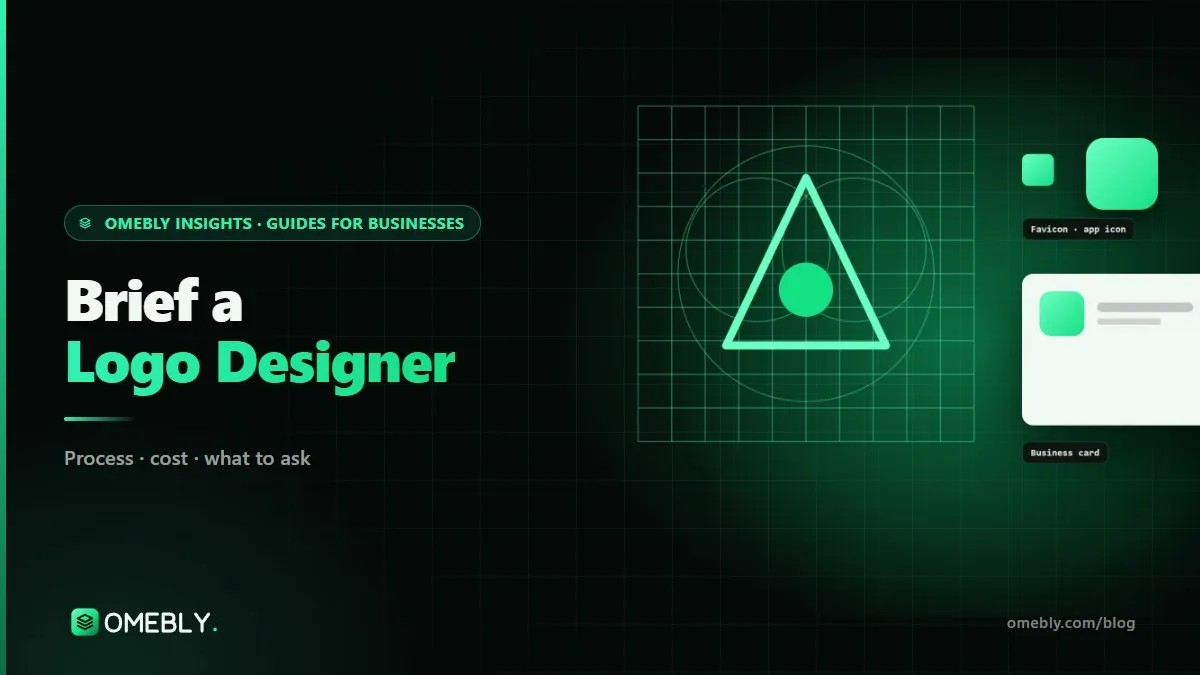
A logo that looks rich on a large screen can turn into a smudge at 16 pixels. Google’s guidance on favicons in search results is a reminder of how small a brand mark is often shown. Good logos come as a suite: a full version, a compact icon and a wordmark.
5. It works in one colour
If the logo only works in full colour with gradients, it will struggle on rubber stamps, embroidery, newspaper ads and dark backgrounds. Test the idea in solid black first.
Before you write the brief
A brief is easier to write once you know where your brand stands. If you can’t yet say who you’re for and why customers choose you over others, settle that first. Our guide on how to position your brand walks through the method in six steps. A designer can make you look different only once you’ve decided what makes you different.
Also gather:
- Your current logo and files, if you have them.
- Screenshots of five to eight competitor logos and websites.
- A list of every place the logo will appear in the next two years.
- Any elements that must stay, such as a colour customers already recognise.
How to brief a logo designer: the one-page template
Copy these headings into a document and fill in each one in plain sentences.
| Section | What to write | Example |
|---|---|---|
| The business | What you do, in one or two sentences | Same-day laptop repair for small offices in Kolkata |
| Audience | Who buys, and what they care about | Office managers who need machines back fast |
| Competitors | Five to eight names customers compare you with | Two chains, three local shops, manufacturer service |
| Positioning | Why customers choose you | Collection and return the same day |
| Three words | How you want people to describe you | Quick, dependable, straightforward |
| Not this | Impressions to avoid | Cheap, technical, cluttered |
| Must work on | Every use, smallest to largest | App icon, invoice, van livery, WhatsApp profile |
| Constraints | Languages, colours to keep, name length | English and Bengali; keep the existing green |
| References | Logos you like and dislike, with a reason | “Like this one: bold and simple. Dislike this: too thin to read” |
| Decision | Who approves and by when | Founder decides; operations head advises |
The example is for an imaginary business, not a real client.
Why each section matters
- Competitors let the designer avoid category clichés.
- Three words and “not this” give a fair test for every concept.
- Must work on prevents a logo that only looks good on a white page.
- References with reasons are far more useful than references alone. “I like it” tells the designer nothing; “I like how it still reads when tiny” tells them a lot.
Questions a good designer will ask you
Even with a strong brief, expect a first call where the designer digs deeper. Preparing answers saves a round of emails:
- What do customers say about you when they recommend you? Their words often hint at the idea behind the mark.
- Where will most people first see the logo? A brand found mainly through Instagram needs a different emphasis from one seen on shopfronts.
- What must the logo never be mistaken for? Sometimes the real risk is looking like an unrelated, well-known brand.
- Is the name likely to change, or will sub-brands follow? A logo system planned for future product names saves a redesign later.
- What budget and deadline are fixed? A launch date or trade show changes how the work is scheduled.
If a designer asks none of these, ask yourself how they plan to make your logo different from everyone else’s.
How to give useful logo feedback
The brief keeps paying off after concepts arrive, because it gives you language for feedback.
- Judge against the brief first. Does this concept feel quick, dependable and straightforward? Does it stand apart from the competitor screenshots?
- Look at it in context. Ask to see each direction on a website header, an app icon and a sign. A logo is rarely seen alone on white.
- Describe problems, not solutions. “The symbol feels heavy next to the name” helps more than “make it smaller and blue”.
- Sleep on it. First reactions to anything new tend to be cautious. Look again the next day.
- Keep the group small. Showing concepts to twenty people and averaging their opinions produces safe, forgettable logos.
Common logo briefing mistakes
- Asking for “modern, clean and professional”. These words describe almost every logo. Use your three specific words instead.
- Skipping competitors. Without them, the designer may land on the same idea your rival uses.
- Forgetting small uses. App icons, favicons and social profile images are where most logos are actually seen.
- Packing in every service. A logo identifies; it doesn’t explain. Your website and messaging do the explaining.
- Changing the decision-maker halfway. A new voice late in the process usually means starting again.
- Ignoring trademarks. If you plan to register the logo, have a trademark professional check it before you commit. The World Intellectual Property Organization’s trademarks overview explains the basics.
Logo brief checklist
- Business described in one or two sentences
- Audience and what they care about
- Five to eight competitors with screenshots
- Positioning in one line
- Three words to aim for and three to avoid
- Every place the logo must work, smallest first
- Languages, colours or elements to keep
- Liked and disliked references, each with a reason
- One decision-maker named and a deadline agreed
- Plan for how the logo will be used afterwards, such as a usage guide or full brand guidelines
How Omebly can help
Don’t have time to write the brief? You don’t need a finished one to start. As a logo design company, Omebly researches your market and competitors, turns your answers into a one-page brief for your approval, then presents three directions in real settings, followed by two rounds of changes and a full suite with icon, wordmark, colours, type and files for screen and print. If your position isn’t settled yet, we can begin with brand strategy, part of our wider brand building service.
Every project is led by our founder, Nazmul Hussain, with a fixed written quote after a free consultation and milestone payments after each stage. Share your notes, however rough, through the contact page or on WhatsApp at +91 70444 33991.
Fill in the ten sections above before you speak to any designer, and the first concepts will be much closer to what you need.
Frequently asked questions
How long should a logo design brief be?
One or two pages is enough. A brief that runs to ten pages usually mixes strategy, wish lists and personal taste. Keep the facts a designer needs, such as audience, competitors, uses and constraints, and leave the visual ideas for the design stage.
Should I tell the designer what the logo should look like?
Describe the impression you want and the problems to avoid rather than a specific picture. If you already have a fixed visual idea, say so honestly, but give the designer room to explore, because the first idea that comes to mind is often the one competitors already use.
Who in my business should approve the logo?
As few people as possible, ideally one decision-maker with one or two advisers who talk to customers. Large approval groups tend to average out the design until it becomes safe and forgettable. Agree who decides before the brief goes out.
Is it a good idea to include my business name in the logo?
Usually yes for a new business, because people don't yet know the symbol. Many brands use a combination of symbol and wordmark at first, then rely on the symbol alone in small spaces such as app icons and social profiles.
What should I do if I don't like any of the first concepts?
Go back to the brief rather than your taste. Explain which goals each concept misses, such as looking too similar to a competitor or being unreadable at small sizes. If the brief itself was wrong, fix it in writing before the next round.
Can I use a logo I designed with an online generator?
For a test or a side project it can be fine. For a brand you plan to build on, generator logos often rely on shared icons and fonts that other businesses also use, which makes the logo hard to own and harder to protect.
Written by
Nazmul Hussain, Managing Director & Technical Head, Omebly. 10+ years building websites and apps for clients in India, the Gulf, the UK and the US, and mentoring at Omebly Academy. LinkedIn · GitHub
Follow Omebly
New guides, work and launches on every channel.